
PODCAST · business
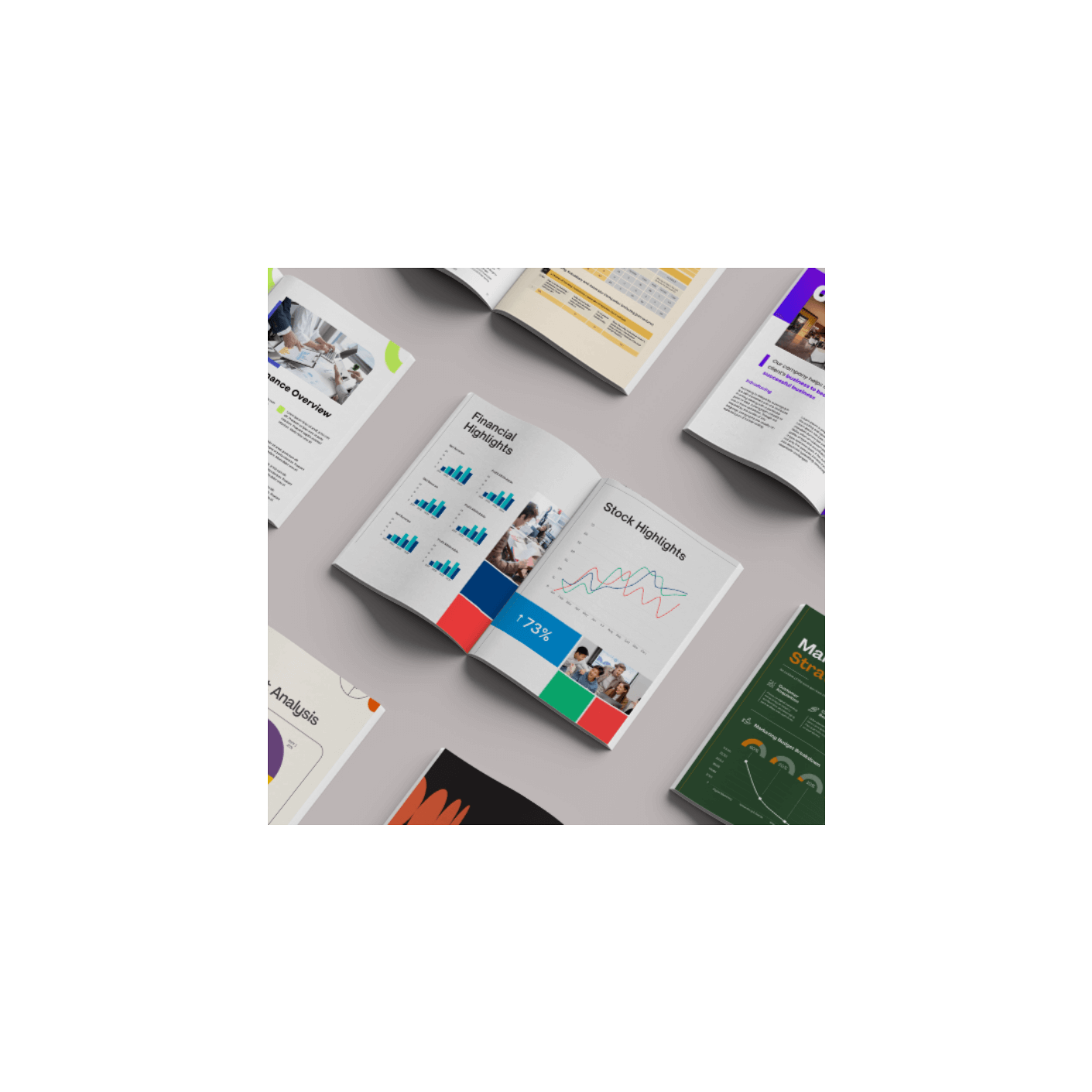
Transforming Reports into Engaging Experiences: 10 UI Design Tips
by Consultivo Group
In today's digital age, corporate reports are more than just spreadsheets and compliance documents. They're powerful stories that shape your brand's image. Join us as we dive into the essential UI design strategies that turn mundane reports into engaging digital experiences. We'll explore how to make your data accessible, captivating, and mobile-friendly.Discover the secrets to:Readability: Choosing the right fonts and layouts for clarity.Engagement: Using interactive charts, animations, and micro interactions.Brand Building: Weaving your brand's story through visuals and narratives.Accessibility: Ensuring everyone can understand your reports.Visual Storytelling: Turning data into compelling stories.We'll cover practical tips for optimizing your reports, from color palettes and white space to mobile responsiveness and interactive na
-
1
Brand Building Through Report UI Design
Introduction:Corporate reports are now vital tools for brand building and communication, not just data dumps. Effective UI design is key to transforming complex data into engaging experiences.Key UI Design Tips:Prioritize Readability:Use clean layouts, legible typography (e.g., Lato, Roboto, Helvetica), and clear visual hierarchies.Importance of professional font usage.Strategic White Space:Avoid clutter; use white space to enhance readability and user experience.Proper spacing between paragraphs, images, and data visuals.Interactive Data Visualization:Transform static tables and figures into dynamic charts and graphs (e.g., Power BI, Tableau).Enhance data comprehension and engagement.Cohesive Color Palette:Strengthen branding and improve readability with a consistent color scheme.Ensure accessibility for colorblind users.Mobile & Cross-Device Compatibility:Design mobile-responsive reports with flexible grids and adaptive layouts.Cater to the growing number of mobile users.Microinteractions:Use subtle animations and hover effects to guide users and enhance engagement.Improve overall user experience without overwhelming readers.Interactive Navigation:Implement hyperlinked tables of contents and in-document navigation for large reports.Enable users to quickly access relevant sections.Visual Storytelling:Incorporate images, case studies, and testimonials to create compelling narratives.Transform data into stories that resonate with the audience.Brand Consistency:Maintain consistent use of logos, fonts, and colors to reinforce brand identity.Ensure coherence across all communication materials.Accessibility & Compliance:Adhere to WCAG guidelines to ensure reports are accessible to all users.Use alt text for images, readable font sizes, and screen reader-friendly formats.Specialized Report Design: ESG Report Design:Convey environmental and social impact through compelling narratives.CSR Report Design:Effectively communicate a company's commitment to social responsibility.User-centric approach to design.Annual Reports Design:Transforming the yearly company report into a powerful brand statement.
We're indexing this podcast's transcripts for the first time — this can take a minute or two. We'll show results as soon as they're ready.
No matches for "" in this podcast's transcripts.
No topics indexed yet for this podcast.
Loading reviews...
ABOUT THIS SHOW
In today's digital age, corporate reports are more than just spreadsheets and compliance documents. They're powerful stories that shape your brand's image. Join us as we dive into the essential UI design strategies that turn mundane reports into engaging digital experiences. We'll explore how to make your data accessible, captivating, and mobile-friendly.Discover the secrets to:Readability: Choosing the right fonts and layouts for clarity.Engagement: Using interactive charts, animations, and micro interactions.Brand Building: Weaving your brand's story through visuals and narratives.Accessibility: Ensuring everyone can understand your reports.Visual Storytelling: Turning data into compelling stories.We'll cover practical tips for optimizing your reports, from color palettes and white space to mobile responsiveness and interactive na
HOSTED BY
Consultivo Group
CATEGORIES
Loading similar podcasts...
Frequently Asked Questions
How many episodes does Transforming Reports into Engaging Experiences: 10 UI Design Tips have?
Transforming Reports into Engaging Experiences: 10 UI Design Tips currently has 1 episodes available on PodParley. New episodes are automatically indexed when they're published to the podcast feed.
What is Transforming Reports into Engaging Experiences: 10 UI Design Tips about?
In today's digital age, corporate reports are more than just spreadsheets and compliance documents. They're powerful stories that shape your brand's image. Join us as we dive into the essential UI design strategies that turn mundane reports into engaging digital experiences. We'll explore how to...
How often does Transforming Reports into Engaging Experiences: 10 UI Design Tips release new episodes?
Transforming Reports into Engaging Experiences: 10 UI Design Tips has 1 episodes. Check the episode list to see recent publication dates and frequency.
Where can I listen to Transforming Reports into Engaging Experiences: 10 UI Design Tips?
You can listen to Transforming Reports into Engaging Experiences: 10 UI Design Tips on PodParley by clicking any episode. We provide an embedded audio player for direct listening, and you can also subscribe via your preferred podcast app using the RSS feed.
Who hosts Transforming Reports into Engaging Experiences: 10 UI Design Tips?
Transforming Reports into Engaging Experiences: 10 UI Design Tips is created and hosted by Consultivo Group.
URL copied to clipboard!