
EPISODE · Sep 12, 2022 · 4 MIN
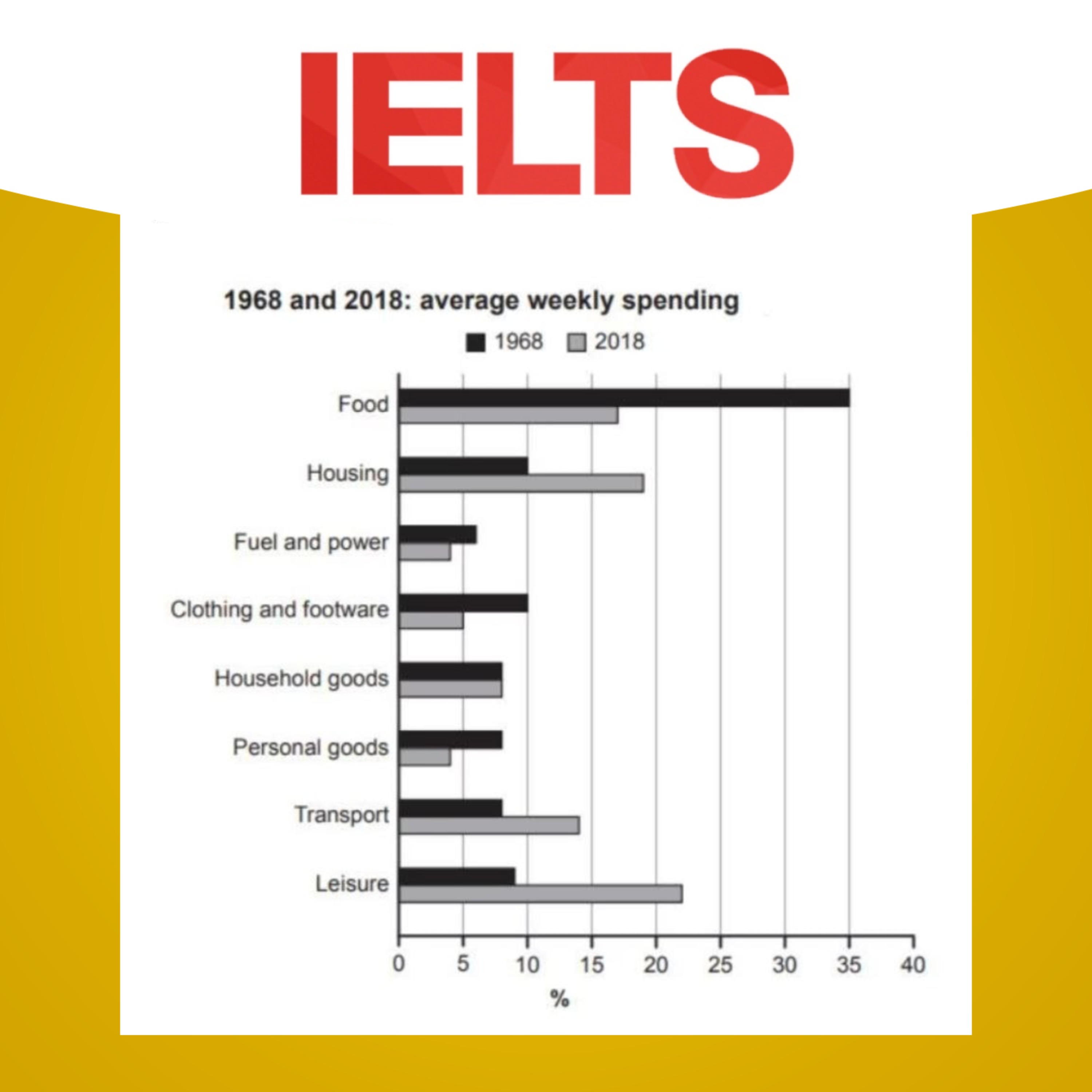
📊 Bar chart: Comparing the average percentages of income spending in two years which are fifty years apart
from IELTS Writing for Success
The bar chart provides information about how families in a country spent weekly income in both 1968 and 2018.Summaries the information by selecting and reporting the main features, and make comparisons where relevant.Write at least 150 words.-Get full episodes of our IELTS Writing Task 1 and 2 episodes: https://linktr.ee/ieltswfsMaria's IELTS writing course: https://course.yourielts.net/ielts-writing-courseListen to our IELTS Speaking podcast: https://linktr.ee/ieltssfsOur social media: https://linktr.ee/successwithielts© 2021 Success with IELTS Hosted on Acast. See acast.com/privacy for more information.
Embed this episode
NOW PLAYING
📊 Bar chart: Comparing the average percentages of income spending in two years which are fifty years apart
No transcript for this episode yet
Similar Episodes
No similar episodes found.
Similar Podcasts
No similar podcasts found.