
EPISODE · Aug 1, 2025 · 43 MIN
Get It Seen: The Simplest Way to Accessible Design
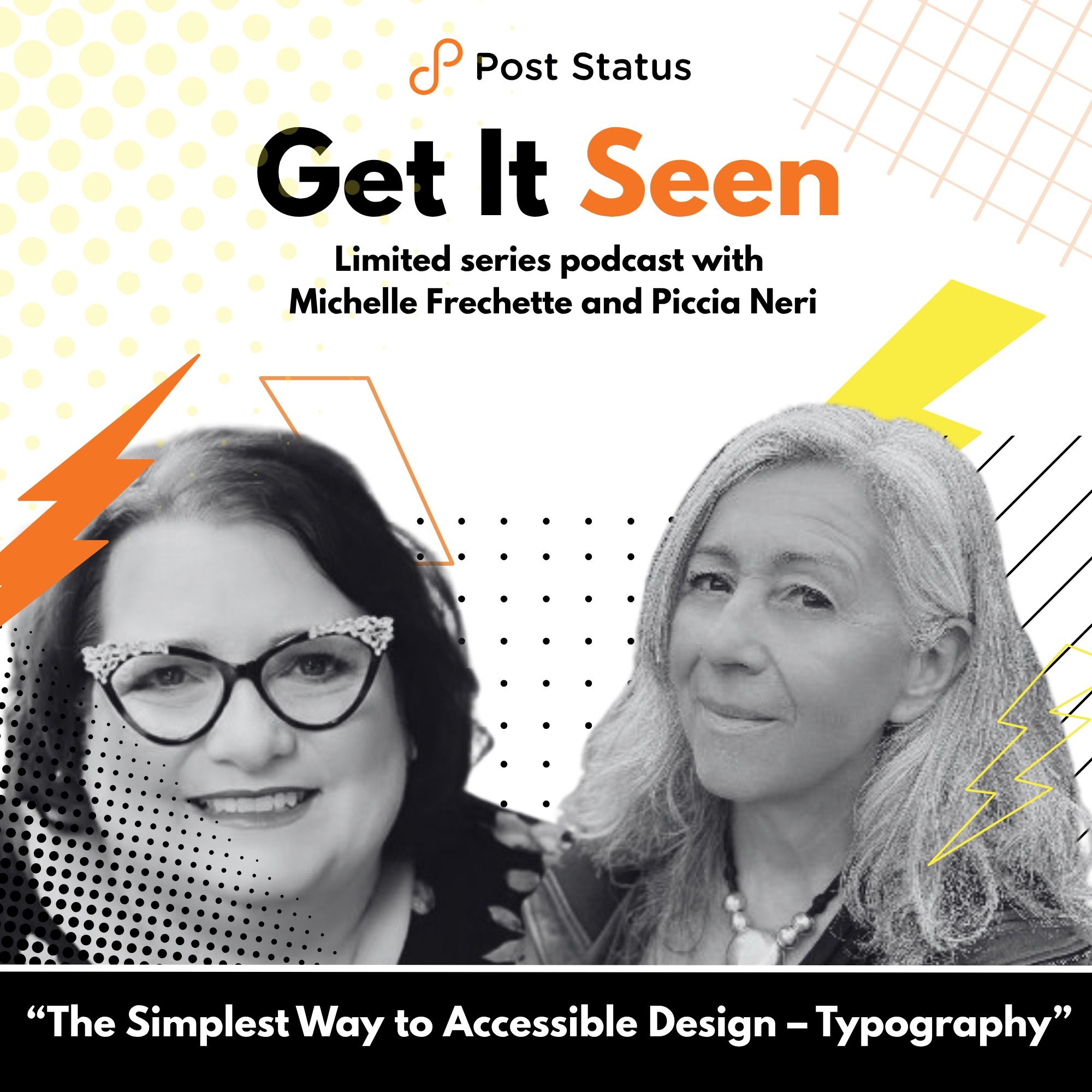
from Post Status Podcasts · host Piccia Neri, Michelle Frechette
In this episode of Get It Seen: The Simplest Way to Accessible Design host Michelle Frechette and typography expert Piccia Neri discuss the vital role of typography in web accessibility. They explore how factors like font choice, size, alignment, kerning, and style impact readability and legibility for all users, including those with visual or neurological differences. The conversation highlights common pitfalls—such as using all caps, centered text, or decorative fonts—and offers practical tips for creating accessible, user-friendly content. Real-world examples underscore how thoughtful typography can improve user experience and even boost website conversions. The episode concludes with a preview of next week’s focus on color and contrast.Top Takeaways:Typography Is More Than Just Fonts — It's a Core Element of Accessibility: Typography includes not only font choices but also layout, spacing, alignment, font weight, size, line height, tracking, and visual hierarchy. These elements together shape how readable and legible text is, directly affecting accessibility and user experience.Readability and Legibility Are Different, and Both Matter: Legibility is about how easily individual letters can be distinguished (e.g., clear letterforms, avoiding imposter letters like I/l/1). Readability refers to how easily blocks of text can be read and understood (e.g., proper line length, avoiding full justification, using appropriate spacing). Both need to be considered when designing for diverse users, including those with dyslexia or visual impairments.Alignment Strongly Impacts Usability and Conversion: Left-aligned text is significantly easier to read, especially online. Centered or poorly aligned text disrupts the reader's visual flow and can make content inaccessible.There Are No Universally "Perfect" Accessible Typefaces: Recommendations like "use sans-serif fonts" or “Arial is accessible” are oversimplified. Accessibility depends on how the typeface is used, whether it distinguishes similar characters clearly (e.g., capital I vs. lowercase L), and whether it's appropriate for your audience. Typefaces like Atkinson Hyperlegible are designed with accessibility in mind, but even these aren’t universally preferred.Mentioned in the Show:Don't Make Me Think Book By Steve KrugAtkinson HyperlegibleSöhne Klim Type Foundry National Klim Type FoundryJosef AlbersAccessible typeface checklist – free resourceAccessible Typography 101 course – 30% discount code: PODCAST30Better Accessibility Through Typography Masterclass – 30% discount code: PODCAST30🙏 Sponsor: WordPress.comBuild and manage professional sites with secure managed hosting on WordPress.com. Beautiful themes, built-in SEO, and payment tools, and access to over 50,000 plugins. Everything you need for your business, plus 24/7 support from WordPress experts. 🐦 You can follow Post Status and our guests on Twitter:Piccia Neri (Accessible Design Lead, Aligned Consulting Group)Michelle Frechette (Director of Community Relations, Post Status)Olivia Bisset (Intern, Post Status)The Post Status podcast is geared toward WordPress professionals, with interviews, news, and deep analysis. 📝Browse our archives, and don’t forget to subscribe via iTunes, Google Podcasts, YouTube, Stitcher, Simplecast, or RSS. 🎧
Embed this episode
What this episode covers
In this episode of Get It Seen: The Simplest Way to Accessible Design host Michelle Frechette and typography expert Piccia Neri discuss the vital role of typography in web accessibility. They explore how factors like font choice, size, alignment, kerning, and style impact readability and legibility for all users, including those with visual or neurological differences.
NOW PLAYING
Get It Seen: The Simplest Way to Accessible Design
No transcript for this episode yet
Similar Episodes
No similar episodes found.
Similar Podcasts
No similar podcasts found.