
EPISODE · Dec 24, 2016 · 7 MIN
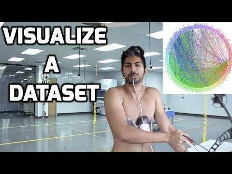
The Best Way to Visualize a Dataset Easily
from Siraj Raval
In this video, we'll visualize a dataset of body metrics collected by giving people a fitness tracking device. We'll go over the steps necessary to preprocess the data, then use a technique called T-SNE to reduce the dimensionality of our data so we can visualize it. Code + challenge for this video: https://github.com/llSourcell/visualize_dataset_demo Keagan's winning code: https://github.com/WeldFire/prepare_dataset_challenge Vishal's runner-up code: https://github.com/erilyth/Pokemon-Type-Classification-Challenge Join us in the Wizards Slack channel: http://wizards.herokuapp.com/ Live T-SNE demo in the browser: http://cs.stanford.edu/people/karpathy/tsnejs/ More learning resources: https://www.oreilly.com/learning/an-illustrated-introduction-to-the-t-sne-algorithm https://indico.io/blog/visualizing-with-t-sne/ http://blog.applied.ai/visualising-high-dimensional-data/ http://machinelearningmastery.com/visualize-machine-learning-data-python-pandas/ Please subscribe! And like. And comment. That's what keeps me going. And please support me on Patreon: https://www.patreon.com/user?u=3191693 Follow me: Twitter: https://twitter.com/sirajraval Facebook: https://www.facebook.com/sirajology Instagram: https://www.instagram.com/sirajraval/ Instagram: https://www.instagram.com/sirajraval/
Embed this episode
NOW PLAYING
The Best Way to Visualize a Dataset Easily
No transcript for this episode yet
Similar Episodes
No similar episodes found.
Similar Podcasts
No similar podcasts found.