
EPISODE · Jul 18, 2026 · 19 MIN
Data Visualisation: The Good, The Bad, The Ugly and the Beautiful (emf2026)
from Chaos Computer Club - recent events feed · host Charlotte Rutherford
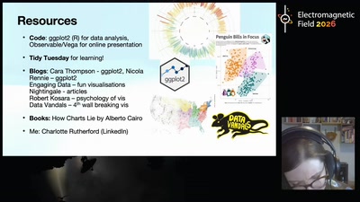
(Alt title - Look at this Graph: How to make Visualisations to be Proud of) You probably encounter at least one data visualisation every day - whether that's in the news, in your own projects, or just scrolling through r/dataisugly. But what makes a visualisation good or bad? Data visualisation lets us leverage the powerful parallel processing abilities of our visual cognition system to understand data in an intuitive way. However, this system is also subject to bias, leaving us vulnerable to misunderstanding if the visualisation is designed poorly. As Tim Harford puts it, it is not always the "ugly" visualisations that are the most misleading, but the "beautiful". In this talk I will discuss some classic dataviz rules of thumb, as well as newer research that may challenge these heuristics (spoiler alert: pie charts might not be as bad as you think!). I'll also discuss some ways you can make your own visualisations beautiful, interesting and trustworthy, using the R package ggplot2 as a worked example. Licensed to the public under https://creativecommons.org/licenses/by-sa/4.0/ about this event: https://www.emfcamp.org/schedule/2026/241-data-visualisation-the-good-the-bad-the-ugly
Embed this episode
Ready to play
Data Visualisation: The Good, The Bad, The Ugly and the Beautiful (emf2026)
No transcript for this episode yet
Similar Episodes
No similar episodes found.
Similar Podcasts
No similar podcasts found.