Hello. Good morning, good evening, good night, dear listeners. Welcome once again to... I've been practicing. Can you tell? It's a bit more strange than previous, so you're holding back a little. It's probably wise. Well, you know, it's not the quantity, it's the quality. And in this case, you're getting neither.
Welcome, of course, to WAM. We are the best, by which I mean only, Warhammer Monthly podcast you'll be listening to this week. And we are now on issue eight, issue eight of Warhammer Monthly. As always, I am Adam, and with me, of course, is Andy Turnbull. And also, before we get into that, did you think back in the day it would last eight issues from picking up issue one? Because as we know, the comic industry is very cutthroat, and titles do not last even worse now. But even back then, publishers were ruthless in terms of culling and carrying. I mean...
Do you remember that Manga UK did a Street Fighter the Manga? Do you remember that? Yes, I remember going around several newsagents in my local town to get all of the issues, because not all of them got men every month. Yes, that was an actual problem. And what it was, even though it was from Manga UK, it was reprinting the Malibu Street Fighter series, oddly enough, which in turn was a rewritten manga.
comic, which was a black and white. It's a really strange story, that one. But because they got higher sales than they were expecting, they then adapted the Street Fighter, the movie, Street Fighter, the animated movie, and then were cancelled around issue 20. So 20 is roughly about what I was expecting this to be, because 20 seems to be the limit for a lot of these comics at this time. 20 was it. But 8, I kind of expected it to get to. I did not expect it to get past 20, and the fact it gets past 20 is impressive. I mean, if I'm being brutalized, I did not think this was lasting sex.
Not a mark on quality, but just because it was so different from what was on the shelves in UK newsagents. Couldn't really tell you what it would do in specialty stores in the US and other territories, but in terms of the UK, it's a US format book, which you can get, it's $2.99, or $2.95, sorry, which is about the same price as the Panini reprints of Marvelware, which were more than, in fact, triple the size, because they were 100 pages at that point. Yep. Three full US issues of material. And this is 36, give or take, depending on certain issues they bump up, and it's black and white. Which I haven't, again, no problem with as an old-school 2010 reader. But that's a harder sale, because the only thing that's consistently black and white that survived on the UK shelves is Commando. Yeah. And that's a very different one. Very different format, and what have you, but... Oh no, I would take issue, because I know a couple of people who actually do current work for it, and things move, because there's a lot more...
there's a bit more more given to historical accuracy now as okay you're of an age that much of the war comics we read growing up or if you got from older brothers or older cousins or what have you they are deeply xenophobic and racist and that was just how it was as i said not not acceptable permitted and let's be clear on that that is always my stance on these things so and they are very much of their time where this was permitted and this was seen as the norm but no they have evolved a bit more into let's say there's a bit more historical accuracy coming into a little less gung-ho uh are the british great because we're not the news can tell you that but the way i always think of commando and i'll be fair here i haven't read commando since about 2005 2006 and even 2005 2006 it still had the big old tally-ho feel to it all the problem is there's new material and there's reprints and they presented reprints unedited which i am in favor of and they point out there is the typical disclaimer of these are products of their time this was produced x i agree you shouldn't be editing the past because you should be showing for what it was to show how ignorant people were and that's that's it so you've got two you generally have two new a month and two here we go reprints
So, like, yeah. But the newer stuff tends to be better. I know a couple of people who do work for it, and they try and pick things about... Colin, who I know more than others, he tends to try and pick things of historical interest and little footnotes around the conflicts rather than... That's cool. But it's not for everyone. And let's see, I dip in and out occasionally. It's an interesting format.
given costs and what have you. It's one that I do not understand why publishers haven't tried to go back to. Particularly with limited shelf space as well and newsagents and what have you. I mean, 2000 AD, could we not get like a little dread like that? Yeah.
I mean, there's nothing wrong with the Black and White Dread. Black and White Dread is sometimes the best Dread. And in a little digest format. So for those who are making a bit of an assumption for some of our listeners out with the glory that is the United Kingdom of Great Britain and North America. If you can't tell the sarcasm, there's a lot. It's a small digest style format. Slightly smaller for the US ones that you've seen with Archie and Jughead and all that. And Marvel did in the 70s and what have you. But it's kind of a nice little pocket. Pocket size one. Dirt cheap. 60 odd pages. Two, three panels a page usually.
but again just one i don't understand why uk publishers are not trying to embrace that i mean i know some of them gave lip service when as mangas come into the shores and become like sales far and away more than anything else far i think so it's like why aren't you trying that in terms of there's clearly a market there for black and white material where there's a lot of page count maybe not necessarily a lot of panels and a lot of story which is kind of which i think is where the disconnect comes from because the uk was very much three pages a week of your strip in an anthology so it's very dense yeah yeah and i think that there's also a mindset And I would disagree with the mindset, but I think there is a mindset of the idea of going back to black and white is a step backwards. And we shouldn't be doing step backwards. We should only be doing step forwards. The problem is that right now, especially over the last maybe 15 years, you can't step forward because there's no market. Some preschool titles, which are just prepackaged, pressed and stuff. The various Lego titles, which are actually, bizarrely, some of them are written by a guy in English for the German market. But what happens is the scripts are translated into German and the German scripts are translated back into English. Of course.
But there you go. And yeah, many reprints are there. We clear that we mean the mainstream market rather than the small press, because it continues to endure and has some very good high spots. Yeah, I'm thinking of the stuff that you're going to W.E. Smith and find. Quantum makes them inroads every now and then, and that's about it. The majority of what you've got as a comic on the shelves at the moment is stuff like Popsic and other identikit comic magazines that are just there to try and shovel off as much free shit.
whereas you get the phoenix and for those that who may not be able to get it there are many many books of a lot of the material that goes they go in i heartily recommend uh neil cameron's mega robo bros and also anything by jamie smart specifically honey versus monkey and lucius buy these books you'll be very happy very very anarchic written for kids but not written down to in the best style of comics and you will enjoy them now the phoenix is amazing it's an amazing thing to have It's the fact that it's had well past issue 300 now, so it's like... Yeah. Yeah, I know. And the fact that it's going from strength to strength is really pleasing to me. As much as it's nice seeing the Marvel Essentials and all that type of thing up there, like the DC Essentials and things, having a homegrown British comic that is now a bona fide success makes me incredibly happy to the Phoenix. Also, fucker toxic. Yeah, we shouldn't do anything for them anymore, so yeah. A legend.
So now we've had our little contextual trip into comics and where we are. The reason we say issues, we ask the question here about issues, is you've had a few months of order, so there's clearly, while Adam was being generous, there are comics that died after three issues because of sales. Three months is the absolute savage cutoff, because by the time the first issue goes to print, two and three are already in the works, you've already paid for printing space at that point. So usually sunk costs. So you'll find a lot of comics, issue three, then what are no issues for? But after we'll speak about that, that still helps. It really does.
That won't heal. No, my favourite cancelled comic story will always be the Panini Thundercats comic that came out around the reboot 2011-ish. Oh, yeah. It ran for, I believe, it's 11 issues. It only had comic material for 10. So there's absolutely nothing in the 11th issue other than daft features and quizzes and stuff, because by that point, sales had tanks. Yeah.
That always made me chuckle. It was entertaining, but the problem with that is they thought, I've got a grand plan to do, I'm going to do my big five-year plan. No, no, don't. That will never happen. The market's changing at this point already. You can see, it's like, I like this, but this is not going to last. It'll take too long to set stuff up. Yeah, which was a shame. Because honestly, there's a lot in that ThunderCatch show, which I thought was absolutely insanely good. And it was a shame that it didn't get the chance to. But it's a shame that the world changed around it. But again, it's also one of these things that it's like, who was looking for, again, it's all nostalgia, even now, it's like, who is looking for a ThunderCatch reboot? Realistically. Well, yeah.
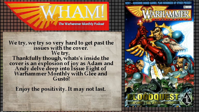
I mean, we now live in a world where Thundercats has had two spin-off miniseries in its reboot through Dynamite, one of the worst publishers of modern comics. I was going to say, I'm going to bleep you're saying Dynamite out there. We digress. However, again, reboots and nostalgia. He says as being a Transformers fan. Yes. Mostly sweet. Very, very much so. We digress. So let's get back to the topic at hand, which is issue eight of Warhammer Monthly, which tells you right off the bat, you can win awesome box games plus hundreds of other prizes. Yes.
I'm going to let Adam kick this off because I know what he's about to say because we've been chasing the evolution of the covers over the last couple of months in terms of they're finally hitting the mark in terms of composition images, colour choices, all that they're kind of doing the job that we expect of a cover which is I like this, this is catching my eye I want to read more over the last couple of months we have seen that the covers have come together they've created some very striking images and images that are very easy to read and very easy to catch off the shelf which is what it's there to do it's there to advertise it's there to sell you what this product is what we have here is some of the most top cow looking bullshit i have seen outside of a wizard cover for dark child it is absolutely the worst of american comic digital coloring and I mean, the line art itself isn't that bad. It's not to my taste. It's not great. But...
the coloring kills it it kills it so hard what makes it worse is there appears to have been two separate colorers by colorists on this because the sheen on the arms does not fit the sheen on the shoulder pads does not fit how the orcs look at the bottom and that's even before you get to the point that there's just these orcs at the bottom there's no those orcs come from a different picture they have come from something else and they've been superimposed over the top because the even the fidelity of the orcs is different to that of the marines above them it is absolute bullshit. It is a free pin-up in 1996 Wizard for a comic character that you didn't give a shit about. That's where it is. That's the level we're at. And I feel really bad dragging Logan the Bearer across the coals like this, but fucking hell, that is awful. Your retort, sir. Oh, I have... I will retort some of it, however I'm broadly speaking in agreement with most of it, so I'll get thinking of Logan the Bearer out of the way very, very quickly in terms of that. So...
One, these are the most spindly looking space marines I've seen in a good long while. Look at Bloodquests. They're chuds. They're big fucking tanks. Right. Look at the arms. Look at the arms. Because that's not metal. It's spandex. It's like, I've got better guns than I'm not in power armor. What I will say is, he gets a lot of the details right. The Iron Halo on the back of the power pack. He knows this stuff. Clearly a fan. But it's like, that needs to be chunkier as fuck.
Yes, there is no way that doesn't actually start stabbing you, basically how it works. That's the whole point. But to be honest, most of it is the colouring that kills it, because what you're trying to do, this is more a thematic piece. It also has no favours done to it by the fact that the strap has been at the bottom, which is how their covers have been for the last couple of issues. So they're clearly going, this is my cover, this is how their cover layout is. That's fine. Did you give that layout to Logan Libera before he drew that?
Because my guess is, no, you fucking didn't. No. Because otherwise... I don't even think this was meant to be this. I think this was meant to be a pull-out, or it was meant to be a black and white picture in 1 or 3 or something. Because you can see, behind the orcs, there is a real shitty attempt at misting up with the clouds, with a spray tool, in order to get a separation between the two. It is awful. Because it's the colouring that kills it. Because I can see what they're trying to do. It's basically a thematic cover of what Blood Quest has been. So you've got your orcs, your menace out in front, and then you've got the space mains now.
To me, what you need to do is one of those needs to have the colors punched up and the other needs to have the colors washed out. Yeah. Because the fact that you've got both of them as satchelors, you're trying to suggest they're kind of on the same plane when the image is telling you they're not on the same plane because this is not an in-camera shot or action. This is a thematic piece. Yes. It's a movie poster. Yeah. So with that in mind, make sure the elements stand out. Now, it's like, okay, the orcs are green. Why is their armor mostly green as well?
I don't know. It's just a myth. It's the biggest problem with computer colouring is murky, murky, murky. It avoids going murky brown, which is one thing, which typically happens. Look up Google Vertigo Brown in comics. Wear when you do it just so you don't get AI bollocks in your results, but Vertigo Brown was a thing.
Yes, it will. I can see what they're trying to do, but again, the colors are so saturated in places, it doesn't pop. Everything has the same level of saturation. The only thing that stands out on that is the glowing planet behind because of the earbrush halo with the glow. But again, just this.
And you've got to get your f***ing lens flares in, because it's 90s. Anyone who's coloured in Photoshop and has coloured at any point in time has used a lens flare. We've all done it. Then you all realise, let's use it sparingly when it matters. Yeah. What gets me about this is it's obvious that it's like, oh, where can I put the lens flare? Oh, here, here will do it.
I firmly believe that the picture itself of the three space brains is a separate piece that was not meant to be coloured and it was not meant to have the orcs at the bottom. I firmly believe that because it's so poorly composited. No, I think the orcs are always meant to be there. I just think the orcs have had. No, because otherwise it's the dead space you've got at the bottom. Because even if you're doing it with the sword going out, it's just...
It is a very, very strange. Colouring kills it more than that. So I'd be interested to see what, like, in the hands of a better colour job. But I still think the strapling doesn't help. And also, whoever was putting the strapling in, let's do a wee gradient tool on the text. Let's not. Yeah, right. Let's make the text stand out. Rather than it look like it's got a weird shadow effect on the orcs. Also, the best thing about it is, you've got that text there telling you what's in the book. Mm-hmm. Yes. Good question. Or not. Captain Eriko. And I don't...
Even if you're looking at that, Adam, when you go to a comic shop, how are comics? Well, usually, they're on a little shelf where there's a little lip that comes up over the very bottom. So, is this text going to be read by anyone at first glance? Not unless they're at less than half a foot high. It's the art of design on a shelf. And again, the covers are good. If you pick it up, you'll read the text, it's fine. But it's not, because the text is awful, because it's got that stupid fucking gradient. It genuinely amazes me. It's like a lot of cover design. Because if I will go into... Because they've got bits right, because your masthead at the top is always, in terms of UK comics, if you've got a prize offer, it's always on that strapline at the very top. Yes. But if you look at any other comic where it puts in stuff...
They don't bury it down there. Look at Transformers, they would have your little lines going out from left to right with log lines of certain things. Streps 2000E would do all the things as well. That's not going to work if it's on the shelf. You're not telling anyone what it was. If you've got your weak ass cover, which you've got a weak ass cover, if you're in occasional war, at this point, you've established the identity of the magazine. So you're likely going to have at this point people who are more into the Warhammer stories. Poor souls, you've suffered. God knows you've suffered. And folks more into that.
Cal Jericho's a selling point for this, so why isn't there a strap line further up just saying Cal Jericho returns? So if I'm walking in the shirt at the newsagents and Glantton's like, oh, the new Warhammer's out. I don't care about the Blood Angel stuff, which you might not. I was like, oh, Cal Jericho's back, brilliant. Yeah. It feels like the actual contents are buried at the very bottom of the page. So, even though you've got the Blood Quest and the Great Big Letters, the choice of colours that they've used, I've wondered, is there a problem with the scams that we've got? But it's not, because I found it on eBay, and it actually looks worse in real-person view. It's awful. If I was commissioning a cover for it, it would very specifically have Leonidas looking like he's about to die at the hands of your chaos-possessed doc. Yes, absolutely. Which is why I firmly believe that this was never meant to be on the cover.
but then they're not there's no other pieces i i think this was commissioned because otherwise like why wouldn't you have done it's like colin you do really good painted stuff do you want to do a dramatic cover for us to do the end well why would we do that yeah we're not off to a good start no but thankfully we got to the highlight of every issue which is a content page oh are you looking forward to next month's more shadows Yeah, I mean, you can get away with it because Shadowfast is mentioned in the things at the Maiden site, but it's like, again, it's only issue nine of Warham monthly, because it's so bad. We're going to move on very quickly, but what I'm going to say is, and it's content's run down. You've got Telstra Dwarf Lords as your new issue in the inside, which is deep in the Great Forest, chaos is stirring, but when three dwarves investigate, they find far more than they bargained for. New series. A little summary of the Cal Jericho strip, Shadowfast, we know it's, and the final episode of Bloodquest. Just the self-indulgent-ish of the two.
The Chaos Warrior on the Space Marine, just get it to fuck. Yes, I look forward to them vanishing. I really do. The more I think about this, this reads very much like someone in the office thinks this is entertaining. They're doing it for themselves, or they're doing it to pop someone else in the office. Self-indulgent shite of the highest order. And I have no time for it. Looks like, based on the cover credits, Logan coloured that himself. Yeah, according to that, yeah. Covered Blood Quest by Logan the Bearer. Yeah, so...
All the kicking is yours, Logan. We are very sorry, but... I will say, though, Logan Libero's current work is really nice. Yes. What he does these days, it's really nice. All art has grown and evolved, but yeah, that's that. But you're also looking at, typically in comics, is if you're commissioning a cover, what you will normally do is you will either hand out a detailed brief for that, or you will go to the artist, I have a cover, it needs to have X, Y, Z. I'd like to see sketches, and then you'll approve it. So the whole point is, Andy Jones approved this.
Yes. I want to talk to Andy Jones. I really do. I sound very much like a threat, Adam, so you better not let me hear this, because he's never going to talk to you. He's like, I want to talk to Andy Jones. I would like to have a discussion with Andy Jones. Does it sound any less threatening? I'm going to have a discussion with you. Me and my boys, we're going to have a little talk with Andy Jones, you know what I mean, right? So...
Like I say, it's just, as we say, it's things being wasted, and fully used, and poorly in service of that. And no, there's, hindsight is 20-20, it's very easy for us to say, and I will always caveat anything that we say, it's very easy to sit back 20 plus years later and go, you know, but it's very, and what I will say is Games Workshop publications, generally, their interior design was functional at best. At this point. While they had a lot of great artists. Always. Their art has always been. Even back to World Trader days. While some of it was mad. Some of it's mental. However.
their actual sense of a design and putting something together was always very bolts and braces. Now, some of it is a legacy of before when they were pre-digital, when you were doing it using your physically compositing pages, electricity and the like. So it's a difficult part. So a lot more challenging to do in those days. But at this point, you're firmly in desktop publishing. You're doing QuarkXPress was their thing at this point. A horrible program, to be honest. Yes, I'd rather step on fire than ever think about that again. Thank you very much. Much I hate Adobe and design was a massive step forward. However, the easiest desktop publishing program to ever use was Microsoft Publisher. Yes.
I do miss that. 100%. Their design was functional, so this doesn't look a million miles away from what they were doing. So is this a, oh, you need to keep the look and feel? Is that an ethos? Is that a mindset? Because I know their design studio was more about designs of miniatures, models, and the games. The actual graphic design element of their publications. You go into any codex or Warhammer Army's book at this point, they're all very identical in terms of how they go. It's just the actual flavour of the trimming. Oh, you're going to have a lower piece. It's going to have some kind of...
It's either going to have some massive heraldic script or it's going to look like some imperial old computer with that. There you go. Job done. At this point, though, the Wahamuramis and the Codex books, they were experimenting with trying to do different things and trying to make each book look different, have a different feel to it. For the better or for the worse, I will say that 3rd Ed's 40k Codexes are my least favourite Codexes. I'm very impressed with what they attempt to do because they try and get a lot of the flavour in the story across in little throwaway parts and in the background.
nuts and bolting the rules and everything directly into the middle of the book. However, because those books are so tiny, you get nothing. It's a master of no trades at all. By the standards of those books, though, this is really badly put together. This is not... It's very hard to read. It's not reader-friendly, new reader-friendly, and that's the biggest thing, because you want to try and hook someone in. So why in that... If Dwarf Lords is my big thing, my new issue, my new thing, I want a big splash, I want an image of that, and just a little sizzle as to why I should care about this.
Yeah. I don't understand why they've got the next month thing down in the bottom and Shadowfast is there. And Shadowfast is in this issue. Why is there next month's Shadowfast? Why is that not a cutout that is just Dwarf Lords which then frees up the space for Cal Jericho, Shadowfast and Blood Quest? It's also you're looking at in terms of next month's Shadowfast. So, he looks like he's fighting this one. So this one, maybe he's not doing that. Maybe he's going to be dull. And again, if your real estate allows it, your next issue should be the inside back cover. Or the cover.
that is it or potentially if you've got a letters page you put it in that as well yes depending on how you do it that is wasted real estate but again so much of this real estate is wasted as we've said I think we've said since episode one and we'll continue to say this for many many more issues shall we get into the stories themselves because I do feel we keep saying that we're not going to get caught up on the contents page and we do every week yeah so we're going to Dwarf Lords part one the delusions of chaos scripted out by Paul Davidson and lettering by Gordon Robson And what we have is the tale of three dwarfs on a little quest. They find things like dragons and minotaurs. But then, after a multitude of fighting, a lot of battling, and some absolutely wonderful black and white rendering, they find themselves in a place that excites me greatly. They are in the Mountains of Morn, home of the Chaos Dwarfs. And I am genuinely excited. This may seem like a really quick overview. That's because, even though this seems to have about 100 pages, there's not a huge amount of story to it. It's just introducing you to a collection of characters and setting up what the story's going to be.
I really like this, Andy. I enjoyed it. I enjoyed it more for the art. The story is, yeah, it's fine. I think the problem is I find dwarfs generally in fiction all cut from the same cloth. To be honest, aside from Terry Pratchett's wonderful work in the Discworld book, dwarfs in fiction are just, everyone is just copied and pasted talking, more or less.
Can we? And to be fair, that's what Warhammer Fantasy was, but a copy and paste of Tolkien slash Michael Muircock. But it's just, can we not get something a bit different? Well, it's one of the things that over the years, they did a really smart thing of, without changing them too much, they shifted them into more of a Yorkshire. It's such a weird thing to have done, but it works. So as the Warhammer Wolves go along, they get a bit more of a Yorkshire...
feel to them, like an old, old Yorkshire Pendle Hill style feel and manner of speech and all these type of things. And that's quite smart because you're absolutely right. Dwarfs are always a half Norse, half Scottish, short, heavily armoured guys who are incredibly stoic and all of gold. And that's it. And prone to violence. That's the thing. It's one of these things that just... Aye.
you're doing it in Universal to be clear again as well the art is fantastic on this Paul Davidson does a tremendous job even just the first page the second panel with the chaos sorcerer practicer of magic and what have you. Just the rendering on that face is beautiful. Yeah, right. So the art. I'll start with the art before we get into the script because there are things I want to talk about in the script as well. The art is absolutely stunning and it feels like Warhammer. And that's a really strange thing to say because it's a Warhammer fantasy strip in a Warhammer themed magazine. However, up until this point, there has been a very small amount of the strips that felt like they were purely Warhammer.
Darkblade could be anything. Outside of some of the mentions, Darkblade is basically D&D. We said Vampire Hunter Delric. Yeah, Vampire Hunter Delric, of course. The, oh, that Dubois curse one that we did was, that was just pure D&D. That wasn't even slightly Warhammer. There was a Skaver one in Tillyer that felt, you know, more Warhammer than most. This one feels like it has, it's stepped out of, like, the Warhammer fantasy roleplay. Yeah, it feels like, this is a little adventure that we had in the game of Warhammer fantasy roleplay, and these are the characters, and we made a comic out of it, and that's great. And the names are amazing. Olive Thumbcrush. Yeah, that's great.
But all in all, there's a real sense of... what I'm trying to say, with a strong 2000 AD energy to it. If you look at the... I mean, the art is, Paul Davison is clearly, there's touches of Bisley in there. Oh, yes. He very much, let's say, you have, I talked about this in other episodes, and I'm going to talk about it in this, and the next episode we record as well. Spoilers, kids. It was a trifecta to the artist who came around in 2008, roughly and around the same time as Bisley, Hicklinton, and Harrison. Yes. And he's a ballsy in here, and I don't mean in terms of he's copying them, it just means he evokes the same feel. Now, to be clear, because...
Artists, as a rule, hate being told, oh, that looks just like so-and-so. It's like, I've drawn it. I'm just, are the sum of your influences? Things are in there. There's even shades of a bit of Liam Sharp. It's lovingly rendered.
but there also has the right idea for things like all the scratchy stuff on the chains and the rocks and then you get to the vortex. I don't need to do daft energy effects, just pure vitality. It's one of the things that a lot of people tend to forget when dealing with characters of stature is how to make them fall small, how to make them feel big. The biggest thing is everybody since about the 90s drawing Wolverine. Yes. How many times does someone have to put a handbook in front of you to say, he is five foot fuck all. Yes. He will not go nose to nose with Cyclops because he can.
That was not standing on a Tom Cruise box, anyhow. This is even before Hugh Jackson gets the film role. It's like, no, he's a short-arsed little guy. He's short and unpleasant. Do that. So with dwarves, you want to be playing with that. You want to be making it clear that they are smaller than the surroundings. And again, you're in a Chaos Cultist temple, so nothing should be to their size. No, no. I mean, the sequence where you've got the Minotaur, just having the Minotaur coming down above them. Just look at it. It's so... It's just perfect. It's perfect framing.
I genuinely adore this. No, the art is exceptional. And to be fair, for the most part in Warhammer, we have, aside from the curse of Dubois, been fulsome enterprises of the art. Because a lot of Warhammer and Warhammer 40k were shaped by the art. Because in the early days, there wasn't that many miniatures. Now, however. So, a lot of the art was the influence for it. And kind of shaped that world and the impressions of those worlds.
So the art is confidence. He knows the story he wants to tell. There's also the lettering. It's clear he's doing some of the sound effects, it's not just a letter, because some of them are very well integrated into the art. That's very Bisley.
It's not copying the same style, it's just making it part of the art. When I talk about lettering, it's one of these things, and we've criticised a lot of the lettering in this. I say we, me. The lettering doesn't feel like it's part of the art, it feels like it's a step removed. Not in this one, it's much more integrated. There is a confidence about this in the writing, sorry, the art, which isn't there in the writing. There's unnecessary captions in there where we can follow that based on what's in there.
yeah so the script there is a very strong script with a very good sense of humor to it but it it doesn't fully trust itself or something that there's something slightly missing from it i mean i love the fact you've got the uh what a load of all crot i'm nobody's lunch crot a discomforting disease contracted from mountain goats that's funny that's genuinely funny it's a little bit of flavor but there's some unnecessary captions in place just as if it's like no the art's telling you the story like if you go for the page when they're when they're attacking the the other guys are coming to try and rescue him it's like wear your manners bully shake his hand so he fires crossbow and then you have the narration on the background of the arrow strikes home and the guardian is quickly dispatched when you've got the other dwarf just chopping his head off yeah the art breathe it's just let the art breathe let it do its thing now again what's your shifting between kind of a little bit of time frame when you're doing a flashback but you're also doing two different geographical scenes you kind of do have to sort of chop and change a little bit with captions to kind of play it back but it's just there are better ways but i'm not entirely clear if this is if this is paul's first proper writing script for which case you can forgive that because that's just yeah it's learning teething um growing pains that's the word i'm after growing pains learning teething i think a lot of it comes down to
There's a real understanding of what the script wants to do and how the art portrays it. The problem lies that I get the feeling that once the script was down, somebody went back in at some point to fill it back in a bit more. Because they're obviously right. I mean, stuff like the bully muscles the wheel to a trembling halt. It doesn't need to be there because you've got the dwarfs standing there. Yeah, there's lots of these little bits. Now again, part of it is you're introducing a number of characters. You're once going to get the names used a couple of times for reinforcements.
you will never find a comic where people speak entirely naturally because people don't speak like they do in comics but there is a way there's a certain way in speaking in comics that's comic natural yes not which is where you can get your exposition in without it being too expository in terms of how it goes well let's say this is a minor niggle because i love this it was great it was just yeah you've got to balance these things out yeah honestly it's great you get your characters you introduce your premise for us oh we're away again both adam i are like bring on part two because Great. The humour is even, as I say, just that, like, the sorcerer's like, where'd you leave him, Bully? And he's hung. I love the dragon. I love the dragon, which, you know, the great devourer, evil dragon of chaos roars at the wounded dwarf. I'm not getting burnt in the bargain. The dragon's safe as they kill. Olive, your hammer. What donk? It's just...
You've got this absolutely gorgeous rendering of a dragon breathing fire. Genuinely, that is freaking awesome. And then you've got this lovely silhouette of the dragon coming down to bite with these ropes of saliva coming out of its mouth. And then it just takes a hammer to the face. It's what makes this... This works in exactly the same way that Darkblade didn't in that it's not poor-faced at all. No. There is a little ridiculousness right the way through the story. Despite the stakes, despite the drama, it's still slightly absurd. Which is what makes it work. Oh, jeez. Genuinely...
When I read through this, I was giddling to myself. I was so happy. It feels right. Yeah, there is a little sense of needing to get a bit more confidence. And hopefully that will come as this goes along. But genuinely, I loved this. I loved Dwarf Lords.
well you did say tie him up that's great no we're really lost nah we're east somewhere hope you're ready for a long walk love it and it's good in terms of what's also is like i do like in fantasy tales where it's kind of low stakes yes it's this quest to get this big giant important artifact because it's the fate of whatever there's like oh no we just our mate got himself into some shit now we need to get back home yep No, I'm with you 100%. One of the major problems I've got with fantasy as a genre, especially high fantasy, is that it's always a fetch quest to save the world. The main reason for that is the Dragons of Autumn Twilight series of books, where every fantasy book that came after it has just mirrored it completely. Not every, that's unfair, but you know what I mean, every generic fantasy book is just mirroring those ones, which in and of itself was just mirroring Lord of the Rings. It kills fantasy for me as a genre because there is so much of it, and you have to hunt out the China Mavils.
um and they're like you know to get the stuff that isn't that because at the end of the day you just there's only so many times you can read the exact same story again and again so having a low stakes adventure is always going to be something that grabs my attention because it's not all important so it's just going to get back home here's a group of guys and they're in this situation give me that one yeah love it love it honestly this may be if this isn't my favorite opener then it's in like a top three out of all of the strips so far it's probably the strongest opener in terms of i want to see more of this without its flaws but i say it's the one that kind of It's also nice that Warhammer finally gets a really good script, because we enjoy Shadowfast, and it's got stuff in it, but this one feels the most Warhammer-y. Yes, it really does. It really does. Yeah, I love it. Love it to bits, and I'm so excited to get more of this. I want more. Shall we move on to some Calderico? Yes, we shall indeed. Arguably, the success story so far. 100%. Because we've liked every installment. Bloodquests have enjoyed. Took you a while when you're on board.
But Cal Jericho in Nemo. Yeah, script by Gordon Rennie, art by Cal Kapinski, and letters by Gordon Robson. Cal finds himself in the midst of an attack by a load of spires who are hunting him down for a bounty. However, however, they find themselves not... They find themselves at the upper hand pinning him to a wall, but also in the deepest, darkest Delac territory. But no, not to worry, because a spymaster, Nemo the Secret Gatherer, has arrived, and he's either going to kill Jericho or let him live. Surprise, surprise, he lets him live because he's more useful alive.
At the same time, Cal now owes him a debt. Yep. This is really good. We've kind of said that this has been a series just of one-offs giving off labour for the world, which is probably the best way to deal with Jericho at this point. But here's your first hint of, we're going to do something a bit more ambitious, potentially. It's giving you the option of, rather than just being, here's your random bounty hunter. Because the problem with stories about bounty hunters are, again, to go back to, they're just little fetch quests for money. Yep, yep. So you kind of need to go around.
And we've kind of had that now with Jericho, where he's done the fetch quest. Now, when he's done that, there's been a sting in the tail where the person that he's found is actually two different bounties, and then he just decides to leave them in a tunnel to be eaten by rats. But yeah, so having the constant, here is a bounty that Cal Jericho is going to go, would have been detrimental to the character. It's effectively a chase scene for most of it, where he's basically hunted down, because he's clearly outclassed, so he knows he's going to like it. And he's talking us through the fact that...
Backhunters are after them are wearing combat rigs which are offworld so he's basically saying it's got to be something that's really rich that's after it and then they do the thing of there's probably a hundred or so that could want them dead that have that kind of money so it's like it's good rather than being oh it must be Stuart so my arch nemesis type thing it kind of avoids the easy path but he points out the fact that we actually get a load of stuff about how it's the noble house is the spire yeah that's oh yeah I think of a hundred degenerative bluebloods who'd want to be dead and he makes easy work of most of them because it's the kind of thing of as is always the way it's a yes you might have the hardware and the technology but you're not on familiar turf yeah Mel, we're the experts, we're going to do this, we're going to come into unfamiliar territory, and we're going to get our asses handed to us. It's a very comfortable, however, undercuts it straight away by pointing out it doesn't mean they aren't capable of the odd surprise or two, and someone comes at them from a wall and basically fixes the wall with some bolts. What I like about this is it continues your trade-off, it's not your kind of your typical, like the Mary Sue comparison would be easy to make if it only gets out of everything. There's a lot of luck, there's a lot of luck, it's not, he's skillful and he's talented, but he's not infallible. Yes. You're seeing that consistently throughout.
Again, it's weird that the Han Solo, the Nicolai Danti comparisons come in. It's like, yes, the lovable rogues and scoundrels who bend the rules and kind of, yeah, a little bit shady, but they're not, they don't win all the time. No. And sometimes it's just dumb luck that gets them through rather than natural skill and ability. Or sometimes it's an evil person and his henchmen. I do like the fact that what saves him here is just the creepy-ass Deluxe turning up. These look very, some of these look very heavily photo-referenced.
But it's not a dig, but when you've got the Cheka and the rest of the Deluxe, this looks heavily like some people might have posed for you on that one. It's like, do you want to be in the Strip? Which is something we called out in the earlier installments. It must be a case of, do you want to be in the Strip? I'm fairly convinced Kalkapinski had a tendency to get his mates to pose and take photos for him. He would not be the first guy. It's not a dig, it's not a Christmas. It's just, yeah, you can kind of feel that's a bit more... I've had people posing for this. They do look straight out of your Cyberpunk 101.
I love it. It is such peak 90s. That's the thing. It's so good. I mean, that is pure Shadowrun right there, isn't it? It's so grotesque in a wonderful way. Yeah. I mean, so you get, obviously, the Delac gangbangers there. They clearly have, let's say, Nemo, who they don't mention his name, but they make it quite clear at this point that the off-worlders clearly, or the bingers clearly know who they work for. Yes. It's nice that there's also clearly there's no bluster or going to order. It's just they like it.
Yeah, yeah. They just go, so it's like, so there's no attempt, so clearly it's a, yeah, let's not, whoever this person is, they have clout, reach, we're not risking being killed. Yeah, exactly. Because their rigs would be enough, based on the fact that the sticks that are there, they could wipe them out easily. Yeah, but it's the ramifications, isn't it? That's the realisation that no matter what you do here, there's going to be fallback from it, a fallout. So we just leg it.
And then we get to meet Nemo himself, who stands out of the shadows, looking like a Shadowrun version of Batman villain Black Mask. What I can only see is kind of... You've got to have your trench coat. Yep. Another trench coat. It's actually... His torso has shades of Davros from the... Russell T. He was here when he's... I've thrown the Daleks back from my skin. And he opens his top and you see the exposed ribcage. Yeah. Kind of got a bit of that to it. Yeah, I can see that. Yeah.
It's just the idea of somebody walking around Necromunda wearing a full gimp mask. It just amuses me greatly. Although when I was reading that, it did make me think of the old BBC Radio 1 adaption of Batman Nightfall. He says, I would kill for praying anything to silence the lighted eyes that dare look at me. Put that back in print, the archive.org is your friend. Ah. I shall go look. Excellent. So you have, at that point, Nemo does the typical kind of... Jericho was fronting in terms of, yeah, I'm freelance, I'm not going to be an errand boy, blah, blah, blah.
And he was just going, I've done you a favour. You now owe me a favour. And this generosity, you don't suppose clues getting me needed, but you owe me. Try and stay alive at least until I can call in your debt. It's, yeah, wonderful. So now I owe a favour to one of the biggest crime lords on the planet. Right now, just hanging here and bleeding slowly to death. Doesn't seem quite such an unattractive option. Perfect. Perfect note to end on. Basically just, yep. Sorry. So the perfect note to end on, basically, he's screwed. He's behind the eight ball now. Yep.
But it's a sword of Damocles as well. It's not an immediate threat, it's just a, yeah, at some point you're going to need to do something for me. And the implication is, you're going to do it, whether you want to or not. I wonder how many issues it is until we get Jericho back. So this feels like it's the, no, no, no, but this feels like the start of a longer story, doesn't it? Yeah. Or just opening out the world, because what we talked about in the last couple, is like, they're just one-offs, they're giving you a flavor for it rather than an ongoing story, because they're quite light, tongue-in-cheek.
but it's just give it give it room to breathe and build up again kind of again i don't want to do the nickel identity comparison too much because they're not the same but that was the same approach in 2008 they kind of took time developing him launched them launched them and then gave you little stories to expand the world i think the problem is with with jericho is if you do a longer story once you've done one long story i think he's kind of done Yes. Yeah, that's a good way of putting it, actually. It's difficult to move characters like this forward, because the whole point about that is your character shouldn't stay the same from one part to the end. They should move forward. If you moved him too far forward, you'd take it. It is the Han Solo problem. Yes. Harrison Ford wanted to die at the end of Return of the Jedi, because he quite rightly pointed out Han Solo's story is done. Yeah. Yeah. And yet, they still brought him back. So he could get killed. On the condition, however, though, I'd die at the end of this, right? Yeah. Get me killed, goddammit.
because your lovable rogue characters kind of they wear out their welcome after a while that's the thing and I don't mean in terms of the readership although that does happen it's more in universe because in universe if you've got your because we've all got our friends who are a little bit yeah that guy but after a while they either grow up or they stop being your friends yes absolutely the lovable rogue brings trouble and there comes a point where you're just like I cannot be doing this you need to go sorry yeah so once the lovable rogue wears itself out in terms of in universe but readers get bored of them after a while yeah and ultimately you do because you kind of have to tell the same style of story over and over again and you say you can't progress the character because if you progress it too much it goes beyond what how it was which is what appealed to the character because again take han solo for example han solo if you read the expanded universe fiction from back in the day which we did it's like
Han Solo is not much of an interesting character in any of the books. You've stopped being a level rogue, kind of, and you're now a general in the alliance, slash what the artist formerly known as the Rebellion. You kind of lose. There's nowhere for you to go, so you kind of lose it. No, I agree. It's like a little short burst, and then you can earn a bigger tail.
As you build the world up, you might have wiggle room for more than one bigger adventure. But it's a fine balancing act to do. As you say, he's had a couple of novels, but can you imagine if they'd done like... Yeah, you have to be right. The idea of any sort of long-form plan for Jericho is a really bad idea. Well, I'm sure Renny probably planned out what he was going on. I probably had a long-term plan for what he would do, but a long-term sustained serial probably... Because to be honest, in terms of bounty hunters as characters...
I'm just trying to think of any that could sustain a long-running series. Dog's a bounty hunter. Yeah, let's not go there. I'd say The Lethal Weapon, Steve Blackman, if we're looking at real life. In terms of fiction, let's go Transformers for a bit. Death's Head. Oh wait, you managed 10 issues, plus the Death's Head 2 era, where you weren't really a bounty hunter at that point, as such. No. And lasted about 20-odds. But still fondly remembered. I love him. Oh yes, absolutely. Deadpool's probably the closest in terms of Marvel, but again...
After Rob Liefel stopped having anything to do with the character and other more talented writers came in and actually made Deadpool the Deadpool you like. Absolutely. I mean, the Joe Kelly Deadpool is just a guy trying to, he just wanted to be a hero and then has that taken away from him. The Joe Kelly Deadpool is the one that's on screen. So, you know, Rob did the design and that's really about it. Yes. The only other one I would call to that's been sort of long-running success, obviously going back to 2008, all hail, is the great Trontium Dog. Yeah.
Yeah, actually. And a lot of the story is kind of spin out of the fact that he's called the Hunter to begin with. Yeah, but you also look at Johnny's not a lovable rogue. The lovable rogues support various supporting characters in it. Like, Wolf's a lovable rogue. Middenface McNulty, he's the straight man. He's the lead, but it's his book. But much as I enjoy Middenface, reading an ongoing adventures of Middenface McNulty would get tedious very quickly. Same for Wolf. Wolf works in contrast with Johnny. Yeah, so once again, it's not the actual point. I think you're absolutely right there. It's not something that's...
It's something that's easily done, anyhow. I mean, yeah, you have. I mean, DC did it with Deathstroke for a while. The next game is ongoing. It got about 50-odd issues. It's still dead enough, but... It actually went on for that long, right? Yeah. Bounty Hunters... Bounty Hunters tend to be supporting characters rather than else. Even in Marvel, because you've got a plethora of them. You've got, like, The Foreigner, Peacemaker... Not Peacemaker, Silver Sable and Harlow. The heroes were higher. Yeah. Craving the Hunter. What a tedious film that was.
I was promised bollocks. I did not get enough bollocks to make a film. How it was less interesting than Morbius, I do not know. That's impressive. It is genuinely impressive to me that someone made a film that is insufferable. They found a way. That's the real mutant power. To make an insufferable movie. Oh, God. Oh, no. It comes to something when, out of all of those films, Morbius and Madame Webber are the two best ones.
Still to watch Maddenweb, I don't have it, I just haven't got round it, so... Harry, don't get me wrong, it's not good. But it is worth playing the game of will she hit with a vehicle this time? Ah, well, we'll see. I'll watch it at some point. And that's even before you get into the entire part. Due to those Sony films, Spider-Man is a knock-off. Oh, get stuffed. Anyhow, should we move on to Shadowfest? My boy. So, it kicks off, we're in Ataloren, the forest where we'd all hang about, and he is...
basically doing his great anti-hero thing as he's doing a burial mound with lots of rocks and your death stands avenged. So what he's doing is he's taking their steeds back to wherever to seal the packs. He's basically, again, just such a good lad. He's a good elf. Well, is he? We'll find out. As he's doing it, he's basically returning them to the soil, effectively. And then he's basically, as he sees the hawks overhead and the warning is as clear as speech. And then he starts getting the swords out. Shit's about to go down.
And then we flash back, so we cut to Elsewhere. I do love an Elsewhere. It's one of my favorite conditions where it's like, we're not telling you exactly where they are, but somewhere. Elsewhere is like thought bubbles, in which you just don't see it anymore. My favorite Elsewhere is, and again, to touch on what we talked about with War Thorns when you're having to switch back, is when Fernand did it in one of the latter eras of latter issues of Transformers in the US, when the first one was ending, and it's Elsewhere. Elsewhere once removed. My favorite one is always going to be Malfa vs. DC, Issue 2.
where it's you've got the street level everything out in the street level it has elsewhere and you have the two brothers who exist outside of reality fighting each other as elsewheres go that's a big gun yeah so you see uh the the band that uh shadowfast encountered last last issue uh i'm basically saying that uh the the guy wants the dancer found so they're basically trying to go fast out into a trap And they're basically saying, it's like, it's dark, and one of them is like, it's dark, it's Lorne for us, basically. Again, we're not on home turf. This is there. And again, no, no, we're all right. Surprise and Weight of Numbers and Darkness will hide us. And what about the others? And it's like, all right. And it turns out they've caught some elves already. And they're basically just torturing and killing them. So it's, again, just nice little bits. They mentioned it's the Waywatcher. It's like, nice little bits. I remember that from Warhammer Army's Wudels, vaguely. And Draddlefast is on them at this point. Because this is where it goes.
with what is possibly my favorite all-time panel of a opponent being dispatched. It's wonderful just dropping the rock straight on his head. The eyes go wide. He crumbles. It's that. Oh, love it. And basically, Shadowfast makes fast work of this. Kills them all. Atholoren will be pleased with this night's offering. I do like how it's like, again, elves aren't good and noble. They're just as brutal as anybody else. Yes. They are bestial at heart.
It's nice to see that ferocity, that barbaric ferocity come out. Rather than the kind of... It's nice they can play that with the Wood Elves a bit more, the savagery, which you can kind of do with Dark Elves, but it's kind of savage and cruel at the same time, whether you're just like, yeah, you know what, I'm just going to be brutal and bloody, because that's how it is. There's no... There is enjoyment he takes from it, just in terms of satisfaction defeating the foe, but it's not a cruel enjoyment, like Dark Blade would have done if he'd had a personality. Yes. And he basically, through the night, keeps tracking them all down, butchering him until there's only one of them, and he's basically, he's waiting.
For the war dancer. And he's got a dirty big hammer. He's a very deformed, mutated chaos beast man. You can tell Simon's taking the beast man as the bases. You know what? I'm going to have some fun with this. Absolutely. The asymmetry of the head, of the eyes. It's so upsettingly off-putting. And they have a wonderful fight. And he basically just says, this is just a test. And it's like, the rack wants to fight you. And he's like, where? And he's like, on the burning wreck of your family tree.
That's such a good... That's so good. That's a wonderful drop of information. It's like, yeah, it's like, it's basically a, while you've been out fighting us, we've been fucking shit up. So Shadowfast just leaps into the air with a boot, kicking the jaw of the demon, the Chaos Beast man he spawned, and he's like, because he goes, no, he goes, yes, the caons have your ancestors. And at that point, he swears his vow and buries both his blades in the Chaos Guy's head.
I'll have Rack's heart before this new day dies. Before he dies, run, Boredancer, run to your death, and you see the last panel, which is glorious. Yeah. In black, you've got the Cairns, which looked to have been defiled with chaos symbols, and you've got Pac standing atop. You can't see he's all in silhouette, everyone's in silhouette, and it's like, ha ha ha! A good evil cackle. It's black, the trees are black, but they're grey because there's a lot of white-out toothpaste bristle flicks. It's just glorious.
It is stunning. It is absolutely stunning. The story in this is very light. There's not much meat to the bones, but that's not what you're here for in the story. It's the kinetic, sinewy artwork. It's complicated and things start to get murky and muddy. Yeah. There's a line to overwrite. All we know is, he's a war dancer. He's avenged some deaths. He's now returned some seats home. Be a good lad. But he finds there's more of the people he dispatched.
the first episode cutting about the forest I will not tolerate these people here I'm going to go and kill them all and then find out that they were there because of you but the best of it is you don't get any the comic book angst recrimination you know the Peter Parker stuff there's none of this we know it's his fault but we're not laboring on it he's just like he gets angry but once it's done he's striding off to confront them with purpose there's no histrionics there's no is it you know for well he's going to go and wreak bloody havoc next issue yeah yeah genuinely excited for the next issue because this was great. Simon Harrison did not do enough comics and so any Simon Harrison art is one to be appreciated and poured over. It's so scratchy and heavily rendered but at the same time it's concise. The rendering doesn't get into the way of the story.
No. There's a lot of people that think in terms of comic art is more lines on the page work. Not always, but there are people who try it and it just obscures the actual storytelling. You want to tell the story. Now, again, all of these panels, there's an energy, there's a movement, there's a dynamism. And there's very little cheating with comic book. There's a lot of comic book language you can do to show blurs and what have you.
He uses it sparingly and allows things like more blood splatter and flow to show the energy in it or the tassels in the brains. That's where you move rather than speed lines. I love speed lines. In their place. But you get the same effect here without any of it. You get the sequence as the L'Oreal is pleased with this Knight's Offerings along the bottom where it's just got these little tiny scenes and they're all on one long panel and it gets across exactly how much damage he's doing to everybody. And there's a sense of movement to it. Sublime. Absolutely sublime.
Yeah. And then you get the giant monster at the end and that thing is gorgeous. Well, that's a wrong word. It's absolutely what you want. Again, it's one of the things is people's standards of beauty are hardwired in that we are designed that symmetry is pleasing to us. Yes. Hardwired into people is why you lay out some things tend to try and go. So it's why something is asymmetrical. It's slightly off-putting. These are the...
There's lots of things that you can do in terms of just art, any type of art, to make things like that effective and unsettling, where you don't have to tell the reader why you're doing it. It's just there, and they will find it unsettling naturally, subconsciously, without having to think about it. It's like, to cite it, it's why Freddy Krueger's sweater is red and green. Because those two colours close together are the most difficult for the human eye to process. Ah, I never knew that. And I did that until listening to an interview with Wes Craven while he was still alive and talked about it. That was one of the reasons behind the colour choice.
That's very cool. It's been one of those DVD documentaries. Yeah. Those things are amazing. It's one of these things that you can do things as a shorthand where you don't have to say, oh, he finds the Chaos Beast unsettling visage. But it does not understand. So you don't need to. Again, we're going to touch on fantasy. Fantasy's got the scope to do purple prose and overwrite so easily in fantasy. Yes, 100%. It's why most people...
Lord of the Rings did more to rehabilitate fantasy than anything else. While you had the purple prose, you had it in context with dynamic action. Then a lot of people read the Lord of the Rings books and went, not happy about that. Because the purple prose is there. Because sorry, Tolkien fans, it's as purple as you like. I mean, at the end of the day, nothing Tolkien ever wrote ever got as purple as anything that Anne Rice wrote. So, winner in my eyes. Someone had to take the bat after a run with it and she did a wonderful job. So purple. So purple the Joker could have worn it as a coat. But, you have to say, we get to say,
All of this is like, so the minute Shadowfast got involved in the last issue, he's caught the attention of the guy that he didn't kill. So it's a nice point that it keeps a reason for the ongoing adventure rather than just being a kind of, here's the next tale of Shadowfast. Again, keeping away from the fetch quest. Yes. A lot of the story seems to be the Batman issue where the simple act of him existing is drawing things to him. And I'm alright with that. It's not a bad story to tell.
again it goes away from the fetch quest which is kind of where which dark blade was yes it's interesting isn't how much the shadow of dark blade just hangs over the the issue even though he's not in this issue he's done he's not back for a little while he really does I don't understand how... I don't know how he came back, to be honest with you, but that's a conversation for the future. Yeah, but like I said, the art from Seine Hazard is wonderfully kinetic. There's energy, but there's also weight to it as well, which is the kind of thing that when you see art being drawn, there are sometimes we see lovingly rendered things and volumes suggested, but they don't feel that there's any weight to it, which his work is always wonderfully eschewed in terms of it. You feel the weight of that kick on the last page when he's just popping the bass.
but it's the going back to the rock being dropped on the guy's head yeah it's a wonderful bit of storytelling because you know the captions don't tell you i'm gonna kill this guy with a rock to the head it is him talking you know if it is me they seek then who am i to disappoint darkness is my ally no friend of theirs they are nothing but easy pickings whilst you're seeing him up a tree with this really sharp rock and just taking this beast man out and it's there's weight there's movement it's such a solid piece of work yeah I think I would recommend to anyone as you you need to go and find as much Simon Harrison art as you can find I recommend short name dog the final solution and Revere Revere is mad because the writer was tripping balls 100% absolutely tripping balls he's quite open about it this was a chemically assisted tale but it's Simon Harrison, a few years before this, glorious, fully painted stuff. But again, it's the same thing. Simon Harrison draws a type of character, in terms of heroes. They generally tend to be relatively lithe, which is why it's such a good fit for an elf, a war elf. They're lithe, they're sinewy, but they're violent at the same time. Again, when he took over Shrannan Dog from Carlos Ascara, people hated it. I loved it, because he was my first. I read it before I read Carlos' stuff. Litheness and sinewy is what I'll say. Again, you'll see he was one of the three.
Well, I should be Hicklinton and Bisley as well. All cut. Coming at it from a similar angle, but not identical. Each of them have a different feel to them in terms of what they do. But again, all of them excel at violence. Violence, muscles, and energy. All three, I'd say, are absolute masters at it.
Honestly, I do remember when I was a kid and this was, you know, being appetised and things. Not really getting on with the art. Because, you know, when you're a kid, you're an idiot. You learn to evolve. Your tastes evolve. I remember not liking Jack Kirby or Mick McMahon. Mick McMahon's a good one, actually, yeah. It's when things click to you. They click, and that's it. As tastes evolve, you'll appreciate it. And in the scene where he confronts, who I'm assuming is jihad, it's never really made clear, but I'm assuming he is. Look at the trees in the background. Just out.
The tones of that just done by painting them black and then hitting them with toothbrushes. Just the level of craft to do that is just... Oh. It's not just in things like that. I want to draw your attention to when he's bringing the hammer down. Yeah. And you said before about speed lines. Oh dear. And what do you... You scrape the ink to make speed lines. Razor blade on paper. Or illustration board. Yeah. And it just makes such an amazing effect. Yeah.
there's something about just to say like i'm doing i've drawn digitally and i've got all the i do still do there's something more there's something that will always be slightly more satisfying to sit down with a pen with pen ink and paper yes yeah i don't want to do it it's a time saver there's many great devices but just there's something that you can do part of it is you don't have an undo button yes if you have a happy accident you have to think you can correct but involves painting or cutting out and putting over so there's a bit more work involved so safety net But yeah, I could sit all day and just talk about how Simon Harrison's job would be amazing. I've been converted. That's the best way of putting it. As I said before, when I was a kid, I didn't get on with it. But then again, I didn't get on with Ian Miller and John Blanche's art because I was a kid and I was an idiot. Stuff like this really sings to me. It calls my name. There's so much for the eye to just get drawn into and you can just swim in it for a little while. Oh, 100%. It's one of the things Frank Miller talks about when you're doing comic.
One of your biggest enemies is the reader. Get them to linger on the page. Yes. And you can do it by cramming lots of words into it. Or you can do it by rendering lots and lots of stuff. And it's not that. It's by making it interesting. Bits that you want to pick out. Because if you do too much detail, it all gets lost.
Because like I say, the page where he confronts, I think, with the background, the backgrounds are quite sparse, actually. If you look at it, it's just some random lines to suggest soil and grass and dirt, and then it's just a big, it's a black, solid black ink for the trees, and then he's just mucked about with a toothbrush. I'm flicking at an emotion which no one who isn't Adam can understand because you can't see me right now. Not a huge amount of detail, but it's enough that it just draws your eyes in. You just can appreciate it.
But again, you're looking at what's just a tree. And then you start to look into how it was done. And that catches you around. And then things are destroyed. Not to say there's an insane amount of cross-hatching on these pages. But you're not drawing natural cross-hatching. You're drawing other bits of it. But it's things to get you to linger on the page. It works. It works beautifully. It's genuinely...
I keep trying to say things like, it's genuinely beautiful. It's not the right word, but it draws you in. It holds your attention. Every single panel is a work about unto itself. It's captivating. The last panel is the best for me. I love silhouettes. I love shadow. I love what you can do with black and white. This is why, could you have done this book in colour? Yes. Would it have made it any better? No. I don't think so. I'd have let Sighton Harrison colour it, but if you'd given it to anyone else, no. I think if you'd lose somebody to the atmosphere. Yeah.
But this is what black and white can do that color can. Yeah, 100%. Yeah, it's stunning. It's an actually stunning piece of work. And I'm constantly, every, you know, we've gone through two issues of Shadowfast now. And every single time, I want more. I want more of this into my veins. It's the first time in this show where we're doing this that I want to jump ahead.
Yeah, I'm not going to, but I want to. This has taken a supreme effort of willpower not to. The other reason I've not, I've read all of Simon Harrison's work in 2010, Revere, Bradley, Short-Name Dog, I've seen all of that body of work, and I've seen most of this years ago, not all, because I didn't get everything from Arma. And there's not a lot of, because he left comics, so there's not a huge amount left, so I'm going to enjoy this. While it's here, I'm going to face myself. And also, knowing how comics work, while we do stuff with the book, he's not going to be around for all of it, because I'm in and out of fashion, so the likelihood is we'll see a few more from him, and that will be him. And I'll be very sad. It's just glorious. I could just wax on you, but just seriously, if you're listening to us and you've got the comic in hand, good, because if you're listening to us and you haven't, I'm worried. That's the only opinions of comics you've never read by two idiots, but...
get that in your hand and, like I say, just pour over those pages, just give yourself the time to just soak in the art and you'll see what we mean just about. I think you need to prefix that with two idiots with a deep abiding look of UK comics. Yes. And a very specific era of UK comics as well. Very much so, yeah. This is getting more niche by the second. But it's glorious. I could sit all day and just evolve into me telling you, go and read it. Go and read everything's like, because you'll enjoy it. Absolutely. I think.
Shall we get into Blood Quest then, because I've got a lot to talk about here. Okay, so what we get first of all is we get a map. Because maps are exciting, kids. Blood Quest, I think you have some words. Blood Quest, us astrographers. Yes. It's like, come on, guys. Because I'm assuming that's meant to be Adeptus Astrographers. I assume so. Yeah, it's like...
Come on. It's clearly they've got one of the guys in the design studio to do it, because this is like the maps for High Fleet Kraken and all that. This is very much of the, aye, come on, we'll borrow one of that. Again, because we're using all the symbols. Because that's the way in England the Blood Angels icon. It is. Again. Beautiful way in England, I'm always happy to see you.
Oh, 100%. He stuck out like a sore thumb in a good way in anything Games Workshop did, because of the boldness, the blocky lines, and the colours. Because I think he used a lot of acrylic looking at stuff. Great. A lot of time for him. But yeah, 100%. I have a lot of time for, let's say, cartoony art. Cartoony style art as well. But you get the confusing map of the... So, if you go from Hal to Secunder, where the sword was lost, Tarsus is the home of the brother of the watch. They then go to Leptis, which is besieged by Orcs. Then there's an arrow going to the Eye of Terror. But they've not...
The thing is, if you've not gone through the Eye of Terror yet, you've basically spoiled the ending of the strip! Yes! Because the Eye of Terror's been mentioned, but not seen yet. Also, you've got your cast list. Well, I'm not being funny, but Furion's dead. Yes. So is Proteus. The big demon monster ate him. Yeah. In the second strip. You're like... It's just not... It's a horrible layout as well.
It is. It's like you did kind of similar for Darkblade at the end, so only now when this trip is coming to end are we going to try and encourage you to give a shit if you don't. It's what I said. It's honestly... Oh, the Diablo is slightly better, but this is bad. This is weird. Yeah. By the way, we've got the Eye of Terror for a book too. Spoilers, kids. I mean, it's everything from the fact that it's trying to tell you the story of Lequest up until this point. Fails miserably. And then proceeds to also fail at being a map that's easy and reasonable. And also fails at being a catalyst and a story so far. It's just, it's almost like you had a page left over and somebody went, oh, hell. We need to, we need to get something out. Oh, it'd be two pages, wouldn't it? Yeah. It's a double page right there, right? Again.
One of the things that I think I've talked about in a couple of episodes before is your comic page real estate. You use it wisely. This is very much the definition of not using it wisely because you effectively have a one paragraph recap showing the ship. What you do underneath the map where you've shown the map, the journal, you do the ship box out at the top. So you then follow the map. I'm going to look at this map journey and then I'm going to look. Oh, that explains the map journey. And then the Eye of Terror. When did you get the Eye of Terror? Did I miss an issue?
Yeah. It's not even that. You follow the map. You follow the Blood Angel Sun world up to where the sword was lost. And then you got the big... You're missing out the Space Hulk completely. That's just been ignored, which is a real shame because that was like the turning point for Blood Quest for me. Then you get to Leptis.
And then you've got all of these other lines that don't mean anything. It's just, what am I looking at? It's an absolute pigsty of a map. It's pointless. And then you get the astrophagraph and the imperial symbol in the background, which just goes so far into making it even muddier than I had to read. I would be annoyed at it, but it's so terribly done that it's hilarious. Yes, oh, it made me laugh when I went into it. It's one of these things. It's also the thing about if you're doing something in full colour.
and you want to then convert it to greyscale. You can't just do the bit on Photoshop that says convert to greyscale. The reason why like old-school black and white TV, the colours on set were so weird. It was to make it look up correctly in the way that you wanted it to come across on screen. It's why Rob Zombie made his Munsters movie the way he did, because it's a throwback to the colours that they were using on set for the Munsters. Yeah. I don't think it's a good idea, because that film is terrible, but...
Rob Zombie and Good Ideas are not Frequent Bedfellow. No, I was just saying we did two good albums and then that's really been, no, three. Yeah, the fact that you look at any colour photograph of a black and white TV show and it's so weird to look at. Genuinely, out there, listeners, if you ever really want to just baffle your head, have a look what the Munsters set looked like. Yeah, because it's all to do to ensure that the readability, what I mean by readability is how things can be seen. Yes. And it's just, just converting something to greyscale isn't enough.
from black and white or from full colour grey scale because it'll go certain ways. Yeah. And what you get here is a murky, solid mess of lines and grey. We've put some cack onto our page and that's it. We're done. But...
Spoiling the ending, quite splendidly. Expectations suitably lowered, unfortunately. So we get back into it, which is a shame, because you kick off with the splash page, and you've got Leonatus on a set of steps, fighting the Garshall, who is clearly a demon of chaos inside, as he tells us. He's on lower steps, going down, and the demon orc is bringing the axe to bear. He's got his trusty chain sword up.
Yep. And they're doing what axes should always do, which is catch swords on the underneath part. Yep. Someone's been paying attention. Yep. That made me very happy. Because nobody... People always forget that's what axes were meant to do. Yeah. They were meant for pulling the sword away, and then going in with the... Then you would go in with your short stabby weapon. Correct. Yes. It's one of those annoying things where axes end up being the main weapon for people, because that's not what they were there for. One thing that bothers me. It's not about the art. It's a bit of lore. It's like...
I'm not being funny. We've played enough games of 40k over the years, Adam. Yes. Would you ever, in the creation of this universe, be sure that your captain's loadout was a chainsaw? No. However, there's a reason why it is. So, if you go back into the early days of 2nd Edge 40k, a sergeant would have a bolter in chainsaw.
So what they've done is they've given Deonatus the sergeant loadout, not the captain. It's very, very strange and unnecessary. There is a reason for it, and that is that in 2nd Dead 40k, a sergeant or a lieutenant would be the ones with a bolter and chainsword, the squad leader. So they've just made him into a squad leader, not a captain. Yeah, I'm sorry, but my captain, if he was in power armour, you're always having a power sword. Yep, power sword and a melter gun, or a plasma gun.
Yeah, typical loadout. Yeah, absolutely. And, yeah, for some unknown reason, they've decided to go, I know, we'll give him the sergeant's loadout, because he's, uh, he's made mistakes. He's been demoted to everything but name. The thing is, he does actually, he does kind of feel more like a sergeant, though. He does. Yeah. The way that he kind of works in the story, he may as well be a lieutenant. Yeah, he does not feel like a ranking officer. No. Which is odd. It's an interesting one. I wonder if Renny did that on purpose. Yeah.
Well, there's every chance that we can get to build a Gordon Renny at some point. So we then cut to there are traitor space marines. Those traitor marines. They are lovely. They do have, however, a lot of the world eaters kind of iconography. They feel like world eaters. I was like, standing about shooting is not very world eatery, even in second edition, which is what was filthy at the time this was wrote. So I was like, not being funny, but I want a bit more acts and murdery.
Yeah, yeah. I think they're probably like a World Eater Succession chapter of the World Shooters or the World Chewers. Going with full lore, do you not think they would just be better being 1000 Suns? It would actually make more sense. It's Rubric Marines. Yeah. Again, hindsight 20, I'm not having a dig, but just think about it. That feels very much like, if you've got like a Chaos Demon Possessed thing, yeah, you've got your, that feels very thinky as well.
Yeah. Hiding behind the oars. Yeah. I mean, I can see why a corn demon would do it as well. So corn does work, but just, I think, if you want kind of a more shooty battle with the marines, then, yeah, I think that kind of feels a bit more rubric marines just following orders. Yeah. I just, without any, because there's no screaming or anything from them either. There's blood for the blood god. Yeah. It's a very reserved. Maybe it's a reserved company. Everyone waitress.
A round of applause for that. There's the name of the show. Episode 8 of Reserved Company. You do get a bit more sort of the horns and what have you and Skullbit, and so... And the guy goes, Blood Angel, do you know how many of your kind I killed when I fought in the service of the Warmaster? I was like, your chapter, your chapter bloodline was stronger in those days. If your ancient brethren couldn't defeat me, what chance do you think you have, weakling? Not you, well, it's you, I want alive. We know why he wants him alive. And if you don't know, he tells you on the next page.
Because this is the excuse for, how can you have new traitor marines in the 41st millennium? They basically steal and brainwash scouts. It's not a bad shelf, yeah. No, it was a thing in the lore, remember? Yeah, yeah. Actually, having it in the comic is quite a good thing. It's really nice. Actually, we've kind of talked about exposition and expository dialogue in less than glowing terms over most of the previous, most of the episode. However, it makes sense here. And again, it's a scout, so he's never encountered chaos, so his dealings will be based on what his...
the more senior marine brethren will tell them yeah good you'll be slave and then i'll eat you all right then the guy gets back up i knew i said something more than just this familiar stench of greens greenskins uh not this one's ready to stone this one belongs to us absolutely nails him with an axe yeah and a power axe as well yeah even your your lower ranking guys have got a better loadout than your captain i mean who put that army less together god reny come on I think Reddy was probably spending all of his time going, how can I min-max this completely? If I give my captain the lowest power low out I can get, then I can give these guys more, and nobody will expect it. Yeah, I suppose. But at the same time, you'd think your captain would be like, hold on to Davey. Davey, Davey, what? I've got this. You're playing with that. Oh, cool on rank yourself. Swap.
Well, it's the fact that you've got to close with the Power Fist and the Power Axe. He is massively overpowered compared to his captain. Also, I think, however, going back to it, I don't think you could load that out. Not Power Fist and Power Axe, no. You couldn't load that out. No, that's an illegal loadout. I mean, rule of cool, I know, but come on. Stick to the audio list. Not Rennie. Rennie must be a rotten part of your player.
It's just a proper beardy one. He's found a way around it. He can only deal with Blood Angels. Oh, man. You're Chaos Champion. Champion guys are easily dispatched. And they comment about the Orcs or his intent on the throne room. And that's where they need to be. Let me... Sorry. It's alright. So, the fight continues between, obviously, Garstall and Leonidas. Again, as we touched on it, it's nowhere near the dynamics of Shadowfast. No, no, no.
That's exactly how it should be, because it's power armor, it's not graceful, it's not dynamic. The orc is massive. Yes, exactly. He's huge even for orc. Do you like the classic beaky marine helmet on the second panel? I did. Yep, I did. Because that looks like it's proper crimson fists and everything. That makes me really happy. It's a nice little bit of a... Clearly someone was just chucking references at Colin McNeil at that point, going, oh, he's like, I'd like to look at that. I love the way you have them going down the stairs, and the white of the floor around them becomes the panel below it. That's so well done. Yes.
Again, it's just, as we said, it's allowing, again, playing with black and white in a way that you wouldn't get to if you were doing that in full colour. No, no, absolutely not. And even, so you compare this, this strip by itself to, like, the opening issues of Blood Quest. It is. Oh yeah. Without losing any of the designs or anything like that. I mean, there's a side-on profile of the Chaos Champion's face. That's amazing! Again, it gets more, Colin has done a bit more rendering as it goes in, so, again, Leonatis is squaring up to Garshall and Cloten comes in with his power fist rippling.
and proceeds to try and rip its heart out. Demon host or not, we are yet to meet one that didn't fall over and die after you ripped its heart out. And congratulations, you've now met one. It's like, ah, it's very much different. Ah, okay. We've made a giant mistake. I'd like to do my choices. And it's like, it still lives, not for long, and at that point, the thing that all brave heroes do, can't come in the back. Yep. When in doubt, Chainsaw to the back usually does the trick.
But it's not completely, though, because the head is just going to float around on the stairs, dripping away, and just mocking, mocking away. Yeah. I do like the an orphan nothing who's come so far, suffered so much an orphan nothing, the sword isn't here, and our quest is a failure. But your quest isn't over yet. It's just a great story. The demon proceeds to tell us in several speech balloons what the map before the story told us with one dirty arrow. I've said the sword, didn't the Eye of Terror. Go and find it. I'll be waiting for you, and all the legions of chaos.
And then Leonidas goes, I'm just going to shoot this severed head with my bolt pistol. I'm having none of this. I've heard it over your nonsense. Pew pew pew. And then goes, it's such a great line. Yeah, but he won't know you've killed his host. You should have said challenge acceptance.
Yes, yes. Although the idea of saying a pity one line too late, it just seems very Blood Angel to me. So, one injury, nobody dead from the massive amounts of Blood Angel he has at his command. Oh wait, the ship's escaping. It's about to leg it to the Eye of Terror. It's creating a warp gate. Straight out of the Venger and Dungeons and Dragons playbook. Yep. I did think it gave me real Saturday morning vibes and I was so, so happy with it. There's no need for it to look like that.
The aesthetics. You've got to love somebody's commitment to aesthetics. And so at that point, you've got... He's like, okay, get me teleport across their ship. I'm going to jump warp in and follow them. The rest of you, you can go. I discharge you of this. The quest is mine. You are free to return to our chapter. And everybody just says, not that. We're all going to the Eye of Terror. Now, the thing is, would they be free to return to the chapter? Given that they embarked on that quest with them, if they went back and went, oh wait, so when the quest got really difficult and the captain said, you can go, you went, aye, all right.
Yeah, see, this is the problem, where their exile ends when they bring the sword back. So they can't go back. I think maybe, as Captain, he could have said, you know, if Smalls, like, few of us are going in, nobody else, you can all go back with your honour intact. We know where the sword is. But I don't see it. Like, you'd just be killed. Or at the very least, like, they've been in contact with Chaos. There's an Inquisitor going to come and have a wee chat with you. And that always happens. It does. It's never going to be a good conversation, that one.
I don't remember them being in the Eye of Terror, so I'm really looking forward to where this goes. I can't remember that bit, but I remember some of the consequences of them being in the Eye of Terror afterwards. I think Book 3? It's funny, I do remember past the Book 3, but I don't remember anything from Book 2. I think Book 3 is where Corbinio does a lot of greywash. Ooh. If memory serves, so it's not... Still lovingly rendered a lot of greywash to make it.
Blood Quest really did just go from strength to strength didn't it? It's one that kind of looking back it's kind of a nice dental introduction into 40k I think I don't want to say the art was basic to start with because it wasn't the storytelling was all there but I think Colin switched into a more rendered a lot more heavy use of black and white in terms of it helped I don't know whether he was told it was going to be colour to start with maybe someone else was going to colour it because it is a lot Because it's not like Colin wasn't skilled at black and white because that's how he broke into the version of me anyway. And has been doing stuff for Shamura and all that in the magazine. So a lot of black and white. So it's not... It just noticeably was a lot more Spartan. So I think potentially it was going to be coloured by somebody, then not. And that's why the art does change style quite dramatically. And once that change takes place, Blood Quest becomes something I really enjoyed. I firmly admit, those first two entries into Blood Quest, I don't like. I really don't like them.
I find them quite bland. Like Darkblade, they're very much episode of the week for your big long quest. Yeah. You make a little progress, but something bad happens, so there are consequences, and you're like, yeah. Again, very much, like I said, it's the Rogue Trooper playbook from classic 2000 AD, but it's just, yeah, it picks up and it becomes a little bit more ambitious. You get, let's see, the Space Hulk episode being fantastic as well, but let's see. Yeah. I mean, it's still a fetch quest. It is. It's got enough to keep me interested. Also,
They've got the quest, but you also go, somebody nicked it for a reason. It's not an arc. Clearly Chaos nicked it. Who in Chaos? You still don't know who he was talking to. No. No, you don't. I doubt it was the champion. Considering how eventually he just went down like a little butterfly. But all in all, yeah, Blood Quest. That's something that I really, really wasn't a fan of to begin with. It became favorite quite quickly. Yeah.
I was always more kindly disposed to 40k stuff anyway because I prefer that over Warhammer Fantasy. And much of the material for fantasy in the early stages has not been a good advert for the product. No, no it hasn't. The Shadowfast and Dwarf Laws are correcting that quite rapidly. Again at this point, 2nd edition it was Blood Angels on the box set cover anyway. Because although 3rd is just coming out, 2nd is your mass market thing at the point of development. So it makes sense that... The Blood Angels are on the front of the 40k box, they're on the front of Space Hulk. Yep.
Blood Angels are the poster boys in the pre-Ultramarines being everywhere days. Incorrect loadouts and everything. Blood Quest ends beautifully. It's such a wonderful end of the book. Yeah. There you go. Book one. We're on there. And it's doing what all sort of long-running quest things do, which is we're going to escalate things now. Yep. Into the Iron Terra. You don't get much of a better escalation than that, do you, really? Yeah, it's all, by the way. Going to literal hell. Yep. You've seen Event Horizon, right, guys? Oh, yeah.
Oh, at this point. Oh yeah, Event Horizon will be out by this point, yeah. So what did you think of the issue as a whole? Because honestly, terrible cook are outstanding. This is probably the best issue of one of the most we've had so far. Yeah, strongest issue. All killer, no filler. Yeah. Yeah, there's not a single one of these, which I would say is bad. No, I understand. I agree. The cover and the intro page are the two things that let it down. In terms of... Blood Quest Map. Yeah, oh, Blood Quest Map made us laugh. It really did. So it brought joy. But again, it's two pages that didn't need to happen.
no no absolutely not but no it's the strongest it's the strongest so it's good to see that it's we're eight issues in it's finding its feet yeah eight issues seems like a long time to be finding its feet but it's the anthology but you're also looking at anthologies are a thing where it's subjective taste as well so there's always an element and for all any anthology you have it's very rare that you will get from all the stories will hit a home run for you i mean it's good when it happens but it's a rarity yeah yeah And this one did it for me. This one absolutely did it. So this is, I think, a solid 9 out of 10. And we don't really rate the issues or anything like that. But if I was going to, I'd do that a solid 9 out of 10. No, it's definitely the best issue so far. All the stories I enjoyed. The ongoing ones I want to see more. Blood Quest, I'll be looking forward to seeing it return. Clearly now it means that we'll get a break of about 4 or 5 issues from that. Same as we'll get for Dark Blade.
I'm going to do something naughty here. I'm going to try and skip forward one. I want to know what replaces Blood Quest for the next issue. It's not replacing it. It's making its comeback. As you'll notice, we are light one-stripped this issue. Oh, yeah. Hang on. I did think that everything felt like it had more pages. And I just thought that was just me. No, Dwarf Lord gets a few more pages. Yeah. I think. Gave it a bumper length one. Demonifuge next time. Dwarf Lord's Demonifuge. Cycles of Chaos and Shadow Blast. Yeah. Back to Demonifuge and the Arsenal Round of Inquisition.
Great. So I think then with all that being said, we shall get out of here and we will see you next time. So thank you very much to you guys at home for listening, if indeed you still are. And thank you very much, Mr. Turbo, for joining me. My pleasure as always. See you next time. Bye, guys.